We all love a good before-and-after story—it’s the reason we watch those home improvement shows, right? You see a space that could use some love, a design team works their magic, there’s a grand reveal (often with tears), and the result is breathtaking. Most importantly, if it’s a good reno, the design successfully meets the family’s unique needs. It’s one of the best parts of our work as designers, product managers, and engineers: the opportunity to make something both enjoyable and practical for a group of real people that needed something better in their lives.
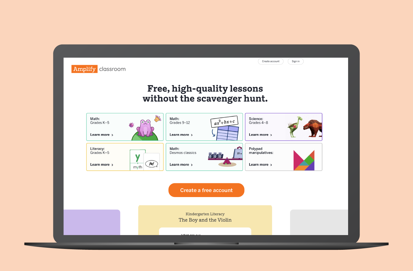
That’s just what we’ve done for this coming school year: put on our Joanna Gaines pants and did an overhaul of the Amplify Classroom activity page.
It’s a big change! So before the official release on June 26, we wanted to share this before-and-after story—what this page is, why it needed some love, how we ran our process, and what renovation moves we made.
And while we don’t necessarily expect tears of joy, we are very eager to hear your reactions!
Wait, what is the activity page?
It’s the essential page that so many of you use every day to deliver interactive lessons that drive student engagement and success. Our math, literacy, and science teams create so many rich learning resources for educators teaching kindergarten through high school—and this page is where those Amplify Classroom activities come together.
This is what it looks like today:

Within a given activity page, you might find:
- At-a-glance lesson information, such as timing and device needs.
- Details about pedagogical approach, such as goals, routines, and standards.
- Thumbnail previews of screens, organized by section.
- PDFs, videos, or images to accompany the lesson.
- Links to related lessons, practices, or assessments.
- The students and classes to which you’ve assigned the lesson.
Amplify’s curriculum teams spend years ensuring teachers have everything they need to be successful in the classroom, which is evident in our activity pages (and in long lists like the one above).
Ok…what’s the issue?
With so many resources comes the risk of overwhelm. Imagine buying a small starter home and filling it with all of your treasures. You might get a work-from-home office, perhaps a cat, maybe a kid or two, eventually a woodworking hobby—and suddenly all the goodness is a bit much. You’re wrestling with too much stuff, digging through piles to find the one thing you need.
Our teachers are feeling this overwhelm in the activity page, and they don’t have the luxury of time to dig around for what they need—not when they have 30 impatient students waiting for them to start, or 10 minutes to prepare for tomorrow.
Here’s what we were hearing:
- “The Assign and Teach buttons are hard to find. I don’t think I would’ve noticed them without someone pointing them out.” —7th- and 8th-grade math teacher
- “It causes me some anxiety that I can’t see the entire lesson at once. I would prefer knowing how many slides there are because it gives me a whole picture.” —7th- and 11th-grade math teacher
- “It’s like Amplify took every suggestion and put them all in. We need it to be more streamlined, as in, ‘Here’s what you need to get through the day in one area, here’s extra stuff in another area.’” —2nd-grade CKLA teacher
We want this page to be a useful guide, not a scavenger hunt. Something had to change.
So what did we do?
Talked to you—we connected with nearly 400 teachers (through surveys and live conversations) to understand your needs, to share our ideas, and to test whether these designs made sense for real teachers using this page.
We dug into the pain points to understand them in more detail. We examined 15 other products to understand how content landing pages are typically laid out, including great ones like Canva, Pear Practice, Notion, YouTube, and more. We talked to our curriculum authors across all subjects to understand their priorities and future plans. We sketched diagrams organizing categories of information on the page, developed them into varied options and clickable prototypes, and refined and iterated and tried again, on repeat.
Throughout these iterations, we heard loud and clear that we needed to:
- Organize the page elements more intuitively, to make it simpler to find things faster.
- Clearly emphasize the actions teachers should take, so there’s never any doubt in the moment of teaching.
Here are some of the design options we explored.

Click to expand each image.


While you gave us some really excellent critique (as all great teachers do, and for which we are forever grateful), you also gave us encouraging signs that we were on the right track. When we shared our final design concept, you said:
- “This activity page seems less overwhelming. It’s just easier on my nervous system.” —3rd-grade CKLA teacher
- “It reads a lot cleaner. I don’t feel like I have to scroll around to find what I’m looking for.” —6th-grade science teacher
- “I love the layout. It’s so easy to see the flow and it got me thinking about pacing and how to chunk student work.” —6th- and 7th-grade math teacher
What does it look like now?
After almost two years of work with your needs at the forefront, we felt confident making three big moves.
- We used tabs to drive page organization, so there are no more long scrolls. Each tab has a clear job to do, and answers a key question for lesson planning:
- What am I teaching? (Screens tab)
- What context do I need to understand? (About tab)
- Which students have access to this? (Sessions tab)
- What additional resources do I need? (Resources tab)
- We created a sticky left sidebar for always-present facilitation actions. The sidebar surfaces high-value information that teachers need quick access to, regardless of which tab they are on.
- We made the lesson flow clearly visible. We gave maximum real estate to screen thumbnails and organized them into sections to show teachers the flow in just one glance.
And now it’s almost your turn to try it!
On June 26, 2026, we will cut the ribbon, open the door, and give you your turn to explore.
If you are a free Amplify Classroom user, you’ll see the new activity page by default. If you’re a paid Amplify customer, you’ll need to opt in to see the new activity page this year. At the end of the upcoming 2026-27 school year, the old page will be retired.
So walk around, live in it for a bit, then tell us what you think! We have more improvements coming, and we are always listening—please contact us here with any thoughts. Thank you to every single educator who joined us on this journey.
Eli and Gretchen are writing on behalf of a huge team of people who delivered this project.
Gretchen Keillor is a Product Design Manager for Amplify Classroom.
Eli Sheldon is a Senior Product Manager for Amplify Classroom.